
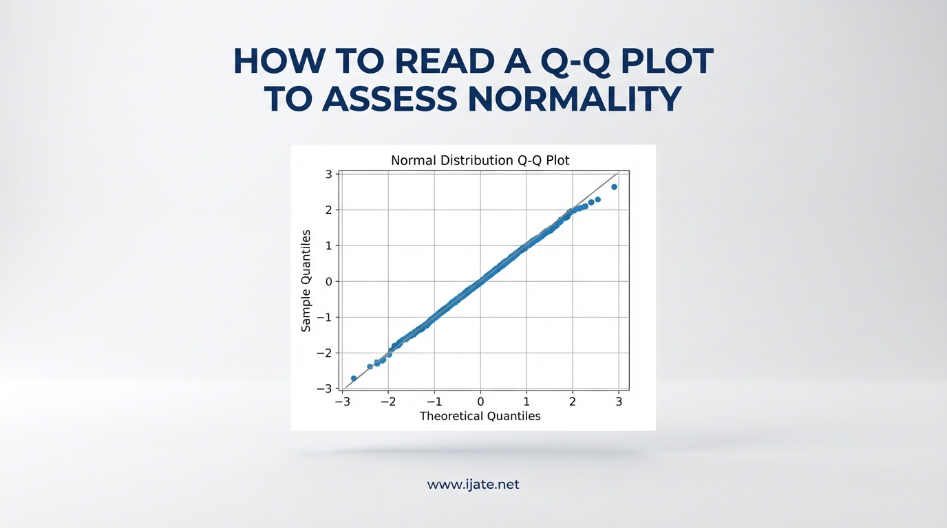
If you have ever stared at a Q-Q plot and wondered whether your data is normal, you are not alone. Most students and researchers I talk to find these plots confusing at first glance. The good news is that once you learn a few simple patterns, reading a Q-Q plot becomes almost automatic.
In this guide, I will walk you through exactly how to read a Q-Q plot to assess normality. I will cover what the plot tells you, how to spot deviations from normality, and what each common pattern means. I will also share practical code examples in both Python and R, plus answers to the questions people ask most often.
By the end, you will be able to look at any normal Q-Q plot and confidently decide whether your data meets the normality assumption for tests like t-tests, ANOVA, and linear regression.
Table of Contents
What Is a Q-Q Plot?
A Q-Q plot, short for quantile-quantile plot, is a graphical tool that compares the quantiles of your observed data against the quantiles of a theoretical distribution. When you are assessing normality, that theoretical distribution is the normal distribution. The plot answers one question: do my data points behave the way normally distributed data should behave?
Here is the key idea. If your data truly comes from a normal distribution, then each data point should line up with its corresponding theoretical quantile. When you plot observed quantiles against theoretical quantiles, the points should fall along a straight diagonal line. That straight line is your visual signal that the data is consistent with normality.
The x-axis of a normal Q-Q plot shows the theoretical quantiles from a standard normal distribution, typically expressed as z-scores. The y-axis shows the observed data values, sometimes standardized. Some software packages label these axes differently, but the logic stays the same.
Understanding Quantiles
A quantile is simply a cutoff point that divides your data into equal-sized groups. The median is a quantile that splits data into two halves. Quartiles split data into four parts. Percentiles split data into 100 parts. When you sort your data from smallest to largest, each data point corresponds to a specific quantile.
The theoretical quantiles on the x-axis come from the inverse of the cumulative distribution function, also called the percent point function or PPF. For a normal distribution, the PPF tells you what z-score corresponds to each percentile. If the 90th percentile of your data matches the 90th percentile of a normal distribution, that point lands on the reference line.
You do not need to memorize the math behind quantiles to read a Q-Q plot. Just remember that each point represents one data value compared to what that value should be if the data were perfectly normal.
Why Q-Q Plots Matter for Normality
Many statistical procedures assume normality. T-tests, ANOVA, linear regression, and many confidence interval calculations all rely on this assumption. If your data is far from normal, your results may be unreliable.
A Q-Q plot gives you a fast, visual way to check that assumption before you run a test. Unlike a formal normality test that returns a single p-value, a Q-Q plot shows you exactly where and how your data deviates. You can see whether the problem is in the tails, the center, or both, which a p-value alone cannot tell you.
I always recommend starting with a Q-Q plot rather than jumping straight to a Shapiro-Wilk or Anderson-Darling test. The plot gives you context that the test statistic hides.
How to Read a Q-Q Plot to Assess Normality
Learning how to read a Q-Q plot to assess normality comes down to three steps. You look at the reference line, you check how closely the points follow that line, and you identify any systematic pattern in the deviations. Let me break each step down.
Step 1: Find the Reference Line
Most Q-Q plots include a straight diagonal reference line. This line represents perfect normality. If every data point sat exactly on this line, your data would be perfectly normally distributed. In practice, real data never sits perfectly on the line, even when it is normal.
The reference line typically connects the first and third quartiles of the data, or it follows the equation of a perfectly normal distribution. Either way, it serves as your benchmark.
Step 2: Check How Closely Points Follow the Line
The next question is whether the points hug the line or wander away from it. Points that stay close to the line throughout the entire range suggest approximate normality. Points that drift away systematically suggest a departure from normality.
Here is where I use what one statistician famously called the fat pencil test. Imagine laying a thick pencil over the reference line. If the pencil covers all the points, the data is close enough to normal for most practical purposes. If points stick out beyond the pencil, you may have a real deviation worth investigating.
The fat pencil test is intentionally subjective, and that is its strength. Statistical judgment always involves context. For a class project with 30 observations, you might accept more deviation than for a clinical trial with 5,000 observations.
Step 3: Identify the Pattern of Deviation
If the points deviate, the shape of the deviation tells you what is wrong. This is the most important skill in reading a Q-Q plot. A systematic, curved, or S-shaped departure carries a specific meaning that you can learn to recognize.
Random wiggling around the line, especially near the tails, is normal. Real data has sampling variability, and the tails of a distribution are where you see it most. The patterns you should worry about are consistent, smooth curves that repeat across the entire plot.
In the next section, I will walk through every common pattern with specific guidance on what each one means.
Sample Size Considerations
One pain point I hear constantly is confusion about how sample size affects interpretation. With small samples, even normal data produces messy Q-Q plots. The points wobble, and the tails may look jagged. Do not panic if your plot looks rough when you have fewer than 50 observations.
With large samples, the opposite problem appears. Formal tests like Shapiro-Wilk become extremely sensitive and flag tiny deviations as statistically significant, even when the data is practically normal. This is one of the main reasons I prefer visual assessment over a raw p-value. A Q-Q plot lets you judge whether a deviation is meaningful for your purposes.
As a rough rule, with samples over 200, focus on whether the overall shape follows the line rather than obsessing over every point. With samples under 50, give the plot some slack and expect noise.
Common Q-Q Plot Patterns and What They Mean
Once you know the patterns, reading a Q-Q plot takes seconds. Here is a reference for every common shape you will encounter, what it indicates, and how to interpret it.
Pattern 1: Points on a Straight Line
When the points follow the reference line closely from end to end, your data is consistent with a normal distribution. The straight line is what you want to see. Minor random deviations are expected and not a cause for concern.
This pattern means you can proceed with statistical tests that assume normality. If you also want numerical confirmation, run a Shapiro-Wilk test alongside the plot.
Pattern 2: Upward Curve (Right-Skewed Data)
If the points curve upward at the right end, forming a convex shape above the line, your data is right-skewed. This means the right tail of your distribution is heavier than a normal distribution would produce. You have extreme high values pulling the upper quantiles away from where they should be.
Right-skewed data is common with income, reaction times, and count data. You can often fix this with a log transformation, square root transformation, or Box-Cox transformation. After transforming the data, generate a new Q-Q plot to check whether the skewness is resolved.
Pattern 3: Downward Curve (Left-Skewed Data)
If the points curve downward at the left end, forming a concave shape below the line, your data is left-skewed. The left tail is heavier than expected. You have extreme low values.
Left-skewed data appears less often than right-skewed data, but it shows up in situations like reaction speed data or scores on an easy test where most people score high. A square or cube transformation can sometimes pull the left tail back toward normality.
Pattern 4: S-Shaped Curve (Heavy Tails)
If the points form an S-shape, dipping below the line at the left end and rising above the line at the right end, your data has heavy tails. This means extreme values occur more frequently than they would in a normal distribution. Both tails are heavier than expected.
Heavy-tailed distributions are common in financial returns, insurance claims, and network traffic data. The center of your distribution may look normal, but the extremes are more spread out. Be cautious using tests that assume normality, because outliers will have a larger impact on your results.
Pattern 5: Reverse S-Curve (Light Tails)
If the points rise above the line at the left end and dip below the line at the right end, your data has light tails. Extreme values occur less frequently than a normal distribution would produce. The tails are thinner than expected.
Light-tailed distributions appear in bounded data, such as test scores capped at 100 or survey responses on a fixed scale. The data is more concentrated near the mean than a normal distribution would predict. This usually causes fewer problems than heavy tails, but it is worth noting.
Pattern 6: Step Patterns or Gaps
If the points form a staircase pattern with flat sections and jumps, your data may be discrete or heavily rounded. This often happens with integer data, Likert scale responses, or measurements recorded to a fixed precision. The Q-Q plot is still useful, but the pattern reflects the data structure rather than a deviation from normality.
Pattern 7: Isolated Points Far From the Line
If most points follow the line but one or two points sit far away from it, you likely have outliers. A single extreme value can distort your entire analysis. Investigate these points to determine whether they are data entry errors, measurement problems, or genuine extreme values.
Do not remove outliers just because they make your plot look bad. Investigate the cause first. If the value is legitimate, consider robust statistical methods or report results with and without the outlier.
Quick Pattern Reference
Here is a quick summary you can refer back to. Straight line means normal data. Upward curve at the right means right-skewed data. Downward curve at the left means left-skewed data. S-shape means heavy tails. Reverse S-shape means light tails. Isolated points mean possible outliers.
Practical Examples in Python and R
Theory is great, but being able to generate your own Q-Q plot makes the concept concrete. Let me show you how to create normal Q-Q plots in both Python and R, plus how to read a detrended Q-Q plot.
Creating a Q-Q Plot in Python
In Python, the statsmodels library provides a straightforward qqplot function. Here is the basic approach.
First, import the function with from statsmodels.graphics.gofplots import qqplot. Then pass your data to the function with qqplot(data, line='45', fit=True). The line parameter adds the reference line, and fit=True standardizes your data before plotting. Call plt.show() to display the plot.
You can also use SciPy directly with scipy.stats.probplot(data, dist='norm', plot=plt). Both methods produce the same type of plot. The statsmodels version gives you more control over the appearance.
For a confidence envelope, which shows the range where normal data points should fall, use import statsmodels.api as sm and call sm.qqplot(data, line='45', fit=True). Some versions add error bands automatically.
Creating a Q-Q Plot in R
In R, the base package gives you everything you need. Use qqnorm(data) to create the plot, then qqline(data) to add the reference line. This pair of functions is the most common approach in academic statistics.
For a more polished plot, the car package offers qqPlot(data) which adds confidence envelopes by default. If you use ggplot2, you can create a Q-Q plot with ggplot(data.frame(x = data), aes(sample = x)) + stat_qq() + stat_qq_line().
In SPSS, the Q-Q plot appears in the Explore menu under Descriptive Statistics. SPSS generates both a normal Q-Q plot and a detrended normal Q-Q plot side by side.
Reading a Detrended Q-Q Plot
A detrended Q-Q plot removes the reference line and instead shows the deviations directly. The horizontal axis represents theoretical quantiles, and the vertical axis shows how far each point deviates from the line. A flat, random scatter of points around zero indicates normality.
I find detrended Q-Q plots useful for spotting small but systematic deviations that are hard to see in a regular Q-Q plot. A curved trend in the detrended plot indicates skewness. A U-shape or inverted U-shape indicates heavy or light tails.
SPSS produces detrended Q-Q plots automatically alongside regular ones. In Python and R, you can create one manually by subtracting the theoretical quantiles from the observed quantiles and plotting the residuals.
Visual Assessment vs Statistical Tests
A common question on statistics forums is whether to trust the Q-Q plot or the formal normality test when they disagree. My answer is that they answer different questions.
A formal test like Shapiro-Wilk asks whether there is statistically significant evidence that the data is not normal. A Q-Q plot asks how far from normal the data is, and where. With large samples, formal tests reject normality for trivial deviations that do not matter in practice. With small samples, formal tests fail to reject normality even when the data is clearly non-normal.
The best practice is to use both. Run the formal test to flag potential problems, then examine the Q-Q plot to judge whether those problems are meaningful for your analysis.
FAQs
How to interpret a normality plot?
Look for points that follow the straight diagonal reference line closely. If the points hug the line from end to end, your data is approximately normal. If they curve away systematically, note the pattern: an upward curve means right skew, a downward curve means left skew, an S-shape means heavy tails, and a reverse S-shape means light tails. Use the fat pencil test for a quick check.
Is a Q-Q plot a normality test?
A Q-Q plot is not a formal statistical normality test. It is a visual diagnostic tool that shows whether your data is consistent with a normal distribution. Formal tests like Shapiro-Wilk, Anderson-Darling, and Kolmogorov-Smirnov produce p-values for hypothesis testing. Q-Q plots complement these tests by showing exactly where and how the data deviates from normality.
How do you interpret normality test results?
A normality test returns a p-value. If the p-value is above your significance level (commonly 0.05), you fail to reject the null hypothesis and conclude the data is consistent with normality. If the p-value is below 0.05, you reject normality. However, with large samples these tests become overly sensitive and flag trivial deviations. Always pair the test result with a Q-Q plot to judge practical significance.
How to interpret Q-Q plot results?
Start by checking whether the points follow the straight reference line. Close alignment means normal data. Then look for systematic deviations: a curve upward at the right end means right skew, a curve downward at the left means left skew, an S-shape means heavy tails, and isolated points far from the line indicate outliers. Random wobble near the line is expected, especially in small samples.
How to interpret a detrended normal Q-Q plot?
A detrended Q-Q plot shows how far each point deviates from the reference line rather than plotting the raw values. Points scattered randomly around zero indicate normality. A systematic curve in the detrended plot indicates skewness. A U-shape or inverted U-shape indicates heavy or light tails. Detrended plots make small deviations easier to spot than a standard Q-Q plot.
What does a Q-Q plot show in GWAS?
In genome-wide association studies (GWAS), a Q-Q plot is used to compare observed p-values against expected p-values under the null hypothesis of no association. If most points follow the reference line with deviations only at the extreme tail, it suggests that most associations are due to chance with a few true signals. Systematic deviation across the entire plot suggests population stratification or systematic bias that needs correction.
Conclusion
Knowing how to read a Q-Q plot to assess normality is a foundational skill for anyone working with statistical analysis. The core idea is simple: points on a straight line mean normal data, curves mean skewness, S-shapes mean heavy or light tails, and isolated points mean outliers. Pair the visual assessment with a formal test and you have a complete picture of whether your data meets the normality assumption.
Practice with your own data is the fastest way to build confidence. Generate a Q-Q plot, try the fat pencil test, and compare what you see to the patterns in this guide. Over time, reading these plots becomes second nature.