
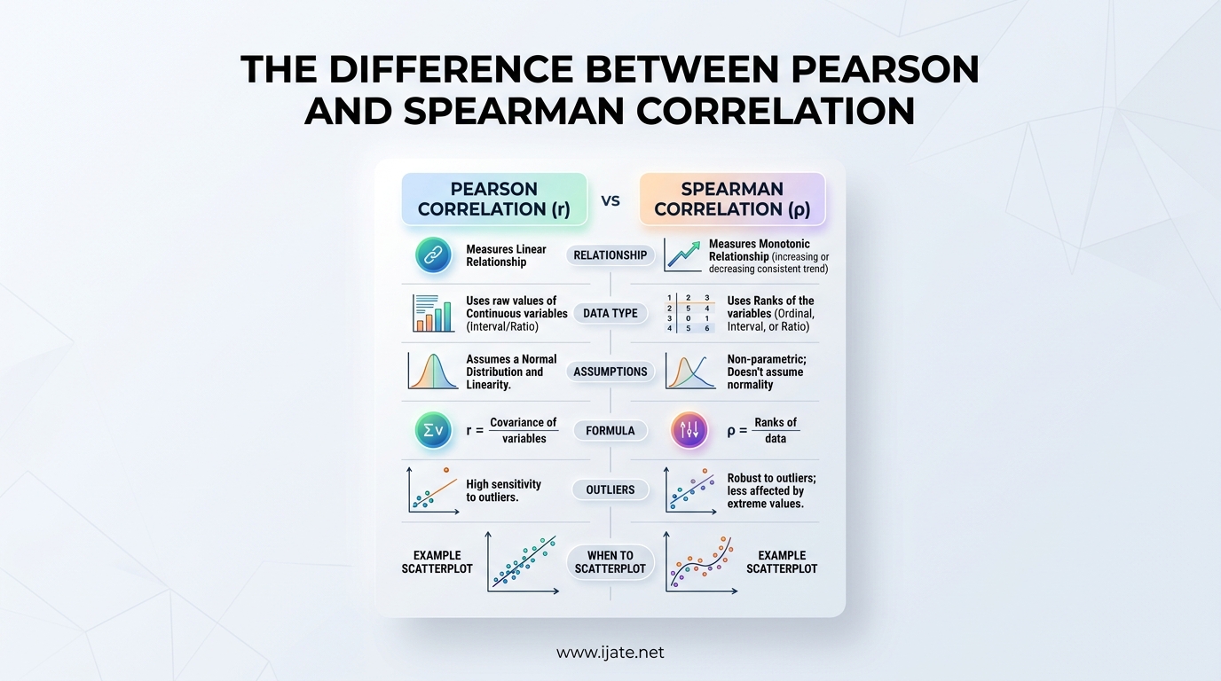
If you have ever stared at a scatterplot and wondered whether to run Pearson or Spearman correlation on your data, you are in the right place. The difference between Pearson and Spearman correlation comes down to one core question: is the relationship between your variables linear, or just consistently directional? Picking the wrong method can hide real patterns in your data or amplify noise that does not actually matter.
I have spent years working with survey data, behavioral metrics, and research datasets where this exact decision changed the conclusions entirely. In one project, Pearson showed almost no correlation between customer satisfaction scores and repeat purchase frequency, while Spearman revealed a strong monotonic relationship that Pearson missed entirely. That kind of discrepancy is not rare, and it matters.
Here is the short version: use Pearson when your data is continuous, normally distributed, and the relationship is linear. Use Spearman when your data is ordinal, ranked, non-normally distributed, or the relationship is monotonic but curved. Throughout this guide, we will unpack what each of those conditions means, walk through formulas and assumptions, compare both methods side by side, and work through a real numerical example so you can see exactly how they behave differently.
By the end, you will have a clear decision framework for choosing the right correlation method, interpreting the results correctly, and avoiding the common pitfalls that catch even experienced researchers off guard.
Table of Contents
What Is Correlation?
Correlation measures the strength and direction of the relationship between two variables. When values of one variable change, correlation tells you whether the other variable tends to change in a predictable way, and how strong that tendency is.
The correlation coefficient always falls between -1 and +1. A value of +1 means a perfect positive relationship, where both variables increase together in lockstep. A value of -1 means a perfect negative relationship, where one variable rises as the other falls. A value of 0 means there is no detectable linear or monotonic relationship between the variables.
Here is a quick breakdown of the three main patterns:
- Positive correlation: As Variable A increases, Variable B also tends to increase. Example: hours studied and exam scores.
- Negative correlation: As Variable A increases, Variable B tends to decrease. Example: price and quantity demanded.
- Zero correlation: No consistent pattern between the two variables. Example: shoe size and typing speed.
The closer the coefficient is to either -1 or +1, the stronger the relationship. Values near 0 indicate a weak or absent relationship. But here is where things get interesting: the way that coefficient gets calculated depends entirely on which method you choose. That is where Pearson and Spearman diverge.
Correlation is a form of bivariate analysis, meaning it examines exactly two variables at a time. It does not tell you that one variable causes the other. It only tells you that they tend to move together in some measurable way. The famous warning applies here: correlation does not equal causation. We will come back to that misconception later, because it trips up a surprising number of analyses.
Pearson Correlation: Measuring Linear Relationships
What Is Pearson Correlation?
Pearson correlation, often called Pearson’s r, is a parametric test that measures the strength and direction of a linear relationship between two continuous variables. Linear means the data points, when plotted on a scatterplot, cluster around a straight line. If you could draw a line of best fit and the points hug it tightly, Pearson is the right tool.
Developed by Karl Pearson in the 1890s, this coefficient is the most widely used correlation measure in statistics. It works by calculating the covariance of the two variables and dividing it by the product of their standard deviations. That calculation tells you how much the variables vary together relative to how much they vary on their own.
The result is Pearson’s r, which ranges from -1 to +1. A positive r means the variables increase together. A negative r means one increases while the other decreases. The magnitude tells you how tightly the data follows that straight-line pattern.
Pearson Correlation Formula
The Pearson correlation coefficient is calculated using this formula:
r = [ n(sum of xy) – (sum of x)(sum of y) ] / sqrt( [n(sum of x squared) – (sum of x) squared] [n(sum of y squared) – (sum of y) squared] )
Breaking that down: n is the number of paired observations, x and y are the individual values of each variable, and the summations run across all data points. The numerator captures how much x and y covary, while the denominator standardizes that covariance so the result always lands between -1 and +1.
An equivalent way to express the same formula uses covariance directly: r = covariance(x, y) / (standard deviation of x times standard deviation of y). Both formulas produce the same result. The choice between them is just a matter of computational convenience.
Assumptions of Pearson Correlation
Pearson is a parametric test, which means it comes with specific assumptions about your data. Violating these assumptions does not necessarily make your results useless, but it does mean you should question their accuracy and consider Spearman as an alternative.
Here are the four main assumptions:
- Both variables are continuous: Pearson requires interval or ratio-level data. Height, weight, temperature, test scores, and revenue all qualify. Categorical or ordinal data does not.
- The relationship is linear: The scatterplot should show a straight-line pattern. If the data curves, Pearson will underestimate the true relationship.
- Variables follow a normal distribution: Each variable should be approximately normally distributed. Severe skewness or heavy outliers distort the coefficient.
- No significant outliers: Pearson is highly sensitive to extreme values because the formula uses raw data points. A single outlier can drastically shift the result.
How do you check these assumptions in practice? Plot your data on a scatterplot first. Always. If the cloud of points looks like a random scatter with no direction, you already know the answer. If it curves instead of running straight, Pearson will understate the relationship. Run a Shapiro-Wilk test or look at a histogram to check normality. Box plots help you spot outliers that might pull the coefficient in one direction.
When to Use Pearson Correlation
Pearson shines when all four assumptions are met. In practice, that means clean continuous data with a roughly normal distribution and a visible linear pattern. Here are the situations where Pearson is your best choice:
- You are measuring the relationship between two continuous variables like height and weight, or temperature and ice cream sales.
- Your scatterplot shows a clear straight-line pattern without obvious curvature.
- Both variables are approximately normally distributed, with no extreme skew.
- Your data has no major outliers that could distort the calculation.
- You need maximum statistical power, since Pearson is more powerful than Spearman when its assumptions hold.
- You are working with large samples where the central limit theorem helps with normality concerns.
In survey research, Pearson is commonly used for relationships between numeric metrics like customer satisfaction scores (when measured on a continuous scale) and revenue figures. In medical research, it might link blood pressure readings to cholesterol levels. In psychology, it could connect reaction times to accuracy scores.
Interpreting Pearson Results
The correlation coefficient tells you both the direction and strength of the relationship, but you also need to consider the p-value to determine statistical significance. The p-value tells you whether the observed correlation is likely real or could have appeared by chance.
Here are the standard interpretation guidelines for correlation strength:
- 0.00 to 0.19: Very weak or negligible relationship
- 0.20 to 0.39: Weak relationship
- 0.40 to 0.59: Moderate relationship
- 0.60 to 0.79: Strong relationship
- 0.80 to 1.00: Very strong relationship
These ranges apply to the absolute value, so a correlation of -0.75 is just as strong as +0.75, just in the opposite direction. Some sources use slightly different cutoffs (0.3, 0.5, 0.7 for weak, moderate, strong), but the principle remains the same.
For the p-value, the conventional threshold is 0.05. If p is below 0.05, the correlation is considered statistically significant, meaning it is unlikely to have occurred by random chance alone. However, with large datasets, even trivially small correlations can reach statistical significance. That is why you should always report both the coefficient and the p-value, and interpret the coefficient in practical terms.
Pearson Correlation Example
Imagine you are analyzing the relationship between study hours and exam scores for 10 students. The data looks linear on a scatterplot, both variables are continuous, and there are no extreme outliers. You calculate Pearson’s r and get 0.82 with a p-value of 0.004.
That r value of 0.82 indicates a very strong positive linear relationship. The more hours students study, the higher their exam scores tend to be. The p-value of 0.004 is well below 0.05, so this result is statistically significant. You can confidently report that study time and exam performance are strongly and positively correlated.
Now imagine the same dataset but with one student who studied 40 hours and scored only 35 percent. That single outlier could drag Pearson’s r down from 0.82 to something like 0.45. This is exactly why checking for outliers before running Pearson is so important. One extreme data point should not be allowed to redefine an otherwise clear relationship.
Spearman Correlation: Measuring Monotonic Relationships
What Is Spearman Correlation?
Spearman correlation, often called Spearman’s rho, is a non-parametric test that measures the strength and direction of a monotonic relationship between two variables. Monotonic means the variables move in one consistent direction, either always increasing together or always moving in opposite directions, but not necessarily in a straight line.
Think of it this way: if every time Variable A goes up, Variable B also goes up (or always goes down), the relationship is monotonic. The rate of change does not need to be constant. The data could curve, accelerate, flatten out, or follow a stepped pattern. As long as the direction stays consistent, Spearman captures it.
The way Spearman achieves this is clever. It first ranks all the values of each variable from lowest to highest, then calculates Pearson correlation on those ranks instead of the raw values. By converting to ranks, Spearman strips away the influence of extreme values and focuses purely on the order of the data points.
This rank transformation is what makes Spearman more robust than Pearson. It is also why Spearman works on ordinal data, where the spacing between values is unknown or inconsistent, but the ranking is still meaningful.
Spearman Correlation Formula
When there are no tied ranks, Spearman’s rho can be calculated with a simplified formula:
rho = 1 – [6 times sum of d squared] / [n times (n squared – 1)]
In this formula, d is the difference between the ranks of each pair of observations, and n is the number of paired observations. You square each difference, sum them up, multiply by 6, and divide by n times (n squared minus 1). Subtract that fraction from 1 to get rho.
When tied ranks exist, the simplified formula is less accurate. In those cases, Spearman is calculated by applying the standard Pearson formula to the ranked data instead. This approach handles ties naturally and is what most statistical software actually does behind the scenes.
Both methods produce a value between -1 and +1, interpreted the same way as Pearson. The difference is that Pearson measures linear association in raw values, while Spearman measures monotonic association in ranked values.
When to Use Spearman Correlation
Spearman is the go-to method when Pearson’s assumptions are violated. Here are the specific scenarios where Spearman is the better choice:
- Your data is ordinal, such as Likert scale responses (strongly disagree to strongly agree) or rank-ordered preferences.
- Your data is continuous but not normally distributed, showing significant skewness or heavy tails.
- The relationship between variables is monotonic but not linear, meaning it curves but still moves in one direction.
- Your dataset contains outliers that would distort Pearson’s calculation.
- You are working with small sample sizes where normality is hard to verify.
- You want to capture rank-order consistency without caring about the exact magnitude of differences.
In behavioral science and psychology, Spearman is the default for survey research involving Likert scales. In market research, it is ideal for analyzing brand preference rankings. In medical research, Spearman is preferred when biomarker data is skewed or contains extreme values from a few patients.
One important note: Spearman does not require normally distributed data, but it does require that the relationship be monotonic. If your scatterplot shows a U-shaped or inverted U-shaped pattern, neither Pearson nor Spearman will capture it well. That is a non-monotonic relationship, and you would need a different approach entirely.
Interpreting Spearman Results
Spearman’s rho is interpreted using the same strength guidelines as Pearson’s r. Values close to +1 indicate a strong positive monotonic relationship, values near -1 indicate a strong negative monotonic relationship, and values near 0 suggest no monotonic pattern.
A Spearman rho of 0.5 means there is a moderate monotonic relationship between the variables. As one variable increases, the other tends to increase as well, but the association is not perfectly consistent. There is still scatter in the ranks.
The p-value works the same way as with Pearson. A p-value below 0.05 indicates the correlation is statistically significant. As with Pearson, large samples can produce significant p-values for weak correlations, so always consider both the magnitude and significance together.
One subtlety: because Spearman operates on ranks, it answers a slightly different question than Pearson. Pearson asks “do the raw values move together linearly?” Spearman asks “do the rankings move together consistently?” In many real-world situations, the ranking question is more relevant, especially when the raw measurements are noisy or the scale is arbitrary.
Spearman Correlation Example
Consider a study ranking 8 restaurants by food quality and by customer satisfaction, both on 1-10 ordinal scales. The data is ordinal, the scales are subjective, and the spacing between a 7 and 8 might not equal the spacing between a 3 and 4. Pearson would treat these as exact numbers and could be misleading. Spearman, by converting to ranks, sidesteps that problem entirely.
You rank the 8 restaurants by food quality (1 = best) and by satisfaction (1 = best). Then you calculate the difference in ranks for each restaurant, square those differences, and plug them into the formula. Suppose the sum of squared differences is 6, and n is 8.
Rho = 1 – (6 times 6) / (8 times (64 – 1)) = 1 – 36/504 = 1 – 0.071 = 0.929. That rho of 0.93 indicates a very strong positive monotonic relationship. Restaurants ranked highly for food quality also tend to rank highly for customer satisfaction.
Pearson vs Spearman: Side-by-Side Comparison
Now that we have covered each method individually, let us put them head to head across every dimension that matters. This is the comparison I wish I had when I was first learning statistics.
Relationship type: Pearson measures linear relationships only. Spearman measures monotonic relationships, which includes linear relationships as a subset. This is the single most important distinction.
Data type: Pearson requires continuous variables (interval or ratio scale). Spearman works with continuous, ordinal, and rank-based data.
Distribution assumption: Pearson assumes both variables follow a normal distribution. Spearman makes no distributional assumption, which is why it is classified as non-parametric.
Outlier sensitivity: Pearson is highly sensitive to outliers because it uses raw values in its calculation. A single extreme data point can swing the coefficient dramatically. Spearman, by converting to ranks first, limits each data point’s maximum influence. The worst outlier in your dataset becomes just the highest rank, no matter how extreme its raw value.
Statistical power: When Pearson’s assumptions are fully met, it has more statistical power than Spearman. That means Pearson is more likely to detect a true correlation when one exists. But when assumptions are violated, Spearman’s power can exceed Pearson’s because it is not thrown off by skewness or outliers.
Parameter: Pearson estimates a population parameter (the linear correlation coefficient) and supports confidence intervals and hypothesis tests based on that parameter. Spearman is non-parametric, so it does not estimate a population parameter in the same way.
What it captures: Pearson captures how well you can predict the exact value of one variable from another using a linear equation. Spearman captures how well you can predict the rank order of one variable from another.
Computation: Pearson uses raw data directly. Spearman adds an intermediate step of ranking all values before applying the Pearson formula to those ranks.
Here is a quick reference table for the most common decision points:
- Continuous, normal, linear data: Pearson
- Continuous, non-normal, monotonic data: Spearman
- Ordinal or Likert scale data: Spearman
- Data with significant outliers: Spearman
- Small sample size with unknown distribution: Spearman
- Ranked or preference data: Spearman
- Large sample with verified normality and linearity: Pearson
Decision Guide: When to Use Pearson vs Spearman Correlation
Let me give you a practical decision framework that works for most datasets. I use this exact process every time I start a new analysis.
Step 1: Plot your data. Create a scatterplot before anything else. Look at the shape. Is it a straight line, a curve, a random cloud, or something else? This single step will guide your decision more reliably than any statistical test.
Step 2: Check your data type. Are your variables continuous (like temperature, revenue, weight) or ordinal (like Likert scales, rankings, grades)? If ordinal, go straight to Spearman. Pearson is not appropriate for ordinal data because it assumes equal intervals between values.
Step 3: Check for normality. Run a Shapiro-Wilk test, examine histograms, or look at Q-Q plots. If either variable deviates significantly from normal, Spearman is safer. For large samples (over 500 observations), normality matters less for Pearson due to the central limit theorem, but it still matters for smaller samples.
Step 4: Check for outliers. Use box plots or calculate z-scores. If you find extreme outliers and they are legitimate data points (not measurement errors), Spearman handles them better. If the outliers are errors, remove or correct them before running either test.
Step 5: Check the relationship shape. If the scatterplot shows a curve rather than a line, ask whether it is monotonic. Does it consistently go up (or down) even if it curves? If yes, Spearman will capture it. If it goes up and then comes back down (U-shaped or inverted U), neither method works well.
Here is a common misconception that causes real problems: many people believe Spearman is always the safer choice, so they default to it for everything. That is wrong. When your data is truly continuous, normally distributed, and linearly related, Pearson has more statistical power. It will detect real correlations that Spearman might miss, especially in smaller samples. Defaulting to Spearman without checking assumptions means you could be leaving real findings on the table.
Another misconception: some researchers run both tests and report whichever gives the better result. This is a form of p-hacking. Decide which test is appropriate based on your data characteristics, not based on which result you prefer. That said, running both as a sensitivity check is perfectly valid and often revealing.
What happens when Pearson and Spearman give very different results? This is one of the most common questions on statistics forums, and it is a meaningful diagnostic signal. If Pearson is low but Spearman is high, you likely have outliers suppressing Pearson, or a non-linear but monotonic relationship. If Pearson is high but Spearman is low, that is unusual and might indicate a relationship driven by a few extreme data points rather than a consistent rank-order pattern.
Researchers in medical sciences actually recommend calculating both coefficients as a routine check. A large gap between the two can reveal hidden correlations that only appear under certain conditions or within specific subgroups of your data. This insight comes from peer-reviewed research that identified threshold effects in COVID-19 data, where correlations were masked in the full dataset but emerged strongly when analyzing specific subsets.
Worked Example: Seeing Both Methods in Action
To make this concrete, let us walk through a small dataset where Pearson and Spearman tell different stories. Suppose you have 6 employees and you measure their years of experience and their performance rating on a scale of 1 to 100.
The data: Employee A has 1 year and scores 50. Employee B has 2 years and scores 55. Employee C has 3 years and scores 62. Employee D has 5 years and scores 70. Employee E has 10 years and scores 78. Employee F has 20 years and scores 96.
Notice the pattern. As experience increases, performance consistently increases, so this is a positive monotonic relationship. But the rate of improvement slows down and then jumps. Employee F’s 20 years and 96 rating is an outlier in terms of raw magnitude compared to the others.
Running Pearson on this data gives approximately r = 0.94. Running Spearman gives rho = 1.0. Both indicate a strong positive relationship, but Spearman is perfect because every employee ranks the same on both variables. Pearson is slightly lower because the spacing is not perfectly linear.
Now let us add a twist. Replace Employee F with someone who has 25 years of experience but scores only 30 on performance, perhaps due to burnout or disengagement. That single data point breaks the linear pattern badly.
With this outlier, Pearson drops to roughly r = 0.05, essentially showing no linear relationship. But Spearman drops to about rho = 0.43, still detecting the general upward trend among the other five employees because it ranks rather than using raw magnitudes. The outlier’s extreme raw values (25 years, 30 score) have a devastating effect on Pearson but a much milder effect on Spearman.
This example illustrates exactly why checking for outliers matters, why understanding the difference between Pearson and Spearman correlation is not just academic, and why running both can give you a fuller picture of your data.
Difference Between Pearson and Spearman Correlation: Frequently Asked Questions
Why use Spearman vs Pearson?
Use Spearman when your data is ordinal, non-normally distributed, contains significant outliers, or shows a monotonic but non-linear relationship. Use Pearson when both variables are continuous, approximately normally distributed, free of major outliers, and the relationship is linear. Spearman is also preferred for Likert scale survey data.
When to use Pearson’s R vs Spearman’s Rho?
Use Pearson’s R when you have continuous, normally distributed data with a linear relationship and no significant outliers. Use Spearman’s Rho when your data is ordinal, ranked, non-normal, has outliers, or the relationship is monotonic but curved. Always check a scatterplot first to confirm the relationship shape before deciding.
Is Spearman or Pearson better for Likert scale data?
Spearman is better for Likert scale data. Likert scales (strongly disagree to strongly agree) are ordinal, meaning the intervals between points are not necessarily equal. Pearson assumes equal intervals and continuous data, so it is not appropriate for Likert responses. Spearman, which works on ranks, handles ordinal data correctly.
Can Pearson and Spearman give different results?
Yes, Pearson and Spearman can give notably different results. This usually happens when outliers are present, the relationship is monotonic but non-linear, or the data is heavily skewed. A large gap between the two values is a diagnostic signal worth investigating. If Spearman is much higher than Pearson, check for outliers or curvature in your scatterplot.
What does a Spearman correlation of 0.5 mean?
A Spearman correlation of 0.5 indicates a moderate positive monotonic relationship. As one variable increases in rank, the other tends to increase as well, but the association is not perfectly consistent. Using standard interpretation guidelines, 0.4 to 0.6 is considered moderate strength. The sign matters too: -0.5 would indicate a moderate negative monotonic relationship.
What is a good Pearson correlation value?
A good Pearson correlation value depends on context, but generally 0.7 or higher (or -0.7 or lower) is considered strong. Values of 0.8 to 1.0 indicate a very strong relationship. In exploratory research, even 0.4 to 0.6 can be meaningful. Always consider the p-value alongside the coefficient, and remember that a high correlation does not imply causation.
What about Kendall tau correlation?
Kendall tau is a third rank-based correlation method, similar to Spearman but calculated differently. It measures the proportion of concordant versus discordant pairs of observations. Kendall tau is preferred for very small sample sizes and is more accurate than Spearman when there are many tied ranks. However, it is less commonly used and less intuitive to interpret than Spearman.
How do I report correlation results in APA format?
In APA format, report the correlation coefficient, degrees of freedom or sample size, and p-value together. For example: r(98) = 0.45, p = .002 for Pearson, or rs(98) = 0.51, p = .001 for Spearman. Italicize r and rs. Report p-values to three decimal places. Include a brief interpretation of the strength and direction of the relationship in your discussion.
Conclusion
The difference between Pearson and Spearman correlation comes down to what kind of relationship you are trying to measure and what kind of data you have. Pearson measures linear relationships in continuous, normally distributed data using raw values. Spearman measures monotonic relationships in ranked data, making it suitable for ordinal variables, non-normal distributions, and datasets with outliers.
Here is the framework to take with you: plot your data first, check whether your variables are continuous or ordinal, verify normality, scan for outliers, and confirm the relationship shape. If everything points to linear and normal, Pearson gives you maximum statistical power. If anything is off, Spearman is the safer, more robust choice.
And when Pearson and Spearman disagree, do not panic. That gap is a signal worth investigating. It might reveal outliers you missed, a non-linear pattern you overlooked, or even hidden correlations that only emerge under specific conditions. Run both, compare them, and let the difference guide you toward a deeper understanding of your data.