
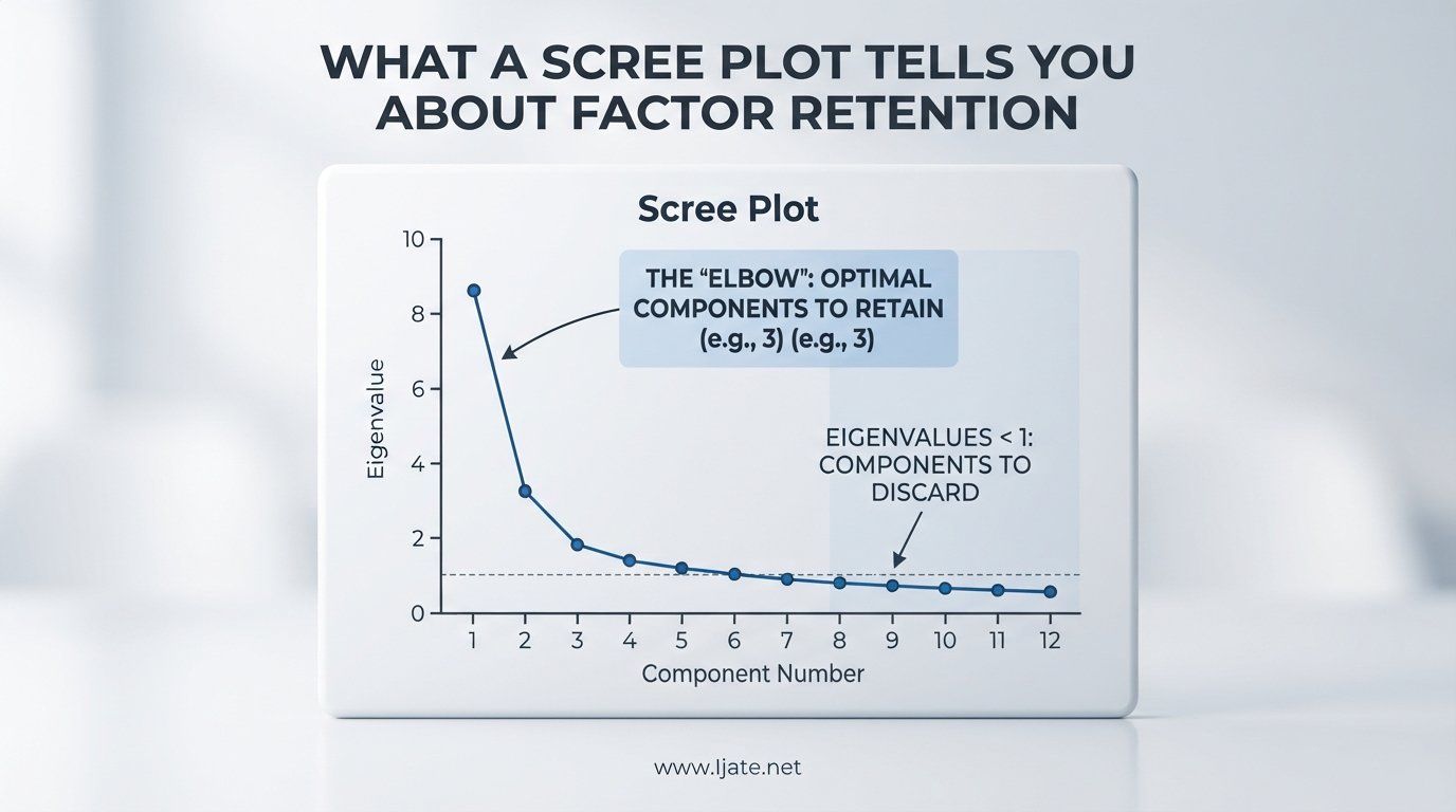
A scree plot is a line graph that displays the eigenvalues of factors or principal components, and it tells you how many factors to retain in factor analysis or principal component analysis. The plot helps you separate meaningful structure from random noise by showing where the decline in eigenvalues flattens out. Understanding what a scree plot tells you about factor retention is one of the most practical skills in multivariate statistics.
If you have ever stared at a scree plot and wondered whether you should keep three factors or five, you are not alone. Reddit users, ResearchGate contributors, and statistics students all wrestle with the same question. The good news is that once you understand the components of the plot and the rules built around it, the decision becomes far more manageable.
In this guide, I will walk you through what a scree plot shows, how eigenvalues map onto the graph, the three main rules for factor retention, and a step-by-step routine you can use every time. I will also cover the common mistakes that lead to over-retention or under-retention of factors.
Table of Contents
What Is a Scree Plot?
A scree plot is a simple line chart where the x-axis lists factors or principal components in order (first, second, third, and so on) and the y-axis shows the eigenvalue associated with each one. The line always slopes downward because the first factor always captures the most variance, the second captures the next largest share, and each subsequent factor explains progressively less. The name comes from the geological term “scree,” which refers to the rubble that collects at the bottom of a cliff.
Psychologist Raymond Cattell introduced the scree test in 1966, borrowing the geological metaphor. The idea is that the early factors form a steep cliff of meaningful signal, while the later factors are the scree, loose rubble of noise at the bottom. Your job is to find where the cliff ends and the rubble begins.
You will encounter scree plots in exploratory factor analysis (EFA), principal component analysis (PCA), and sometimes in confirmatory factor analysis. Every major statistics package, including SPSS, R, Jamovi, and Python’s scikit-learn, can generate one automatically.
What a scree plot tells you about factor retention, at its core, is where the useful information stops. Everything to the right of that boundary is noise that will only complicate your interpretation without adding real insight.
What Eigenvalues Tell You on the Plot
An eigenvalue represents the amount of variance in your original data that a single factor or component captures. If you have 20 standardized variables in your dataset, the total variance equals 20 units. Each factor claims a portion of that total, and its eigenvalue tells you exactly how much.
A factor with an eigenvalue of 3.5 explains 3.5 units of variance, which is substantial. A factor with an eigenvalue of 0.4 barely contributes anything. When you plot these eigenvalues in descending order, the steep initial drop shows that the first few factors are doing the heavy lifting.
Here is why this matters for factor retention: factors with large eigenvalues represent real, shared variance among your variables. They likely correspond to genuine latent constructs. Factors with tiny eigenvalues, on the other hand, represent variance that could easily arise from random sampling fluctuation.
The eigenvalue scale also gives you a reference point. An eigenvalue of exactly 1.0 means the factor explains as much variance as a single original variable. This threshold becomes important when we discuss the Kaiser criterion below.
The Elbow Method (Cattell’s Scree Test)
The elbow method is the oldest and most intuitive way to read a scree plot for factor retention. You look for the point where the steep descent of eigenvalues transitions into a shallow, gradual decline. That transition point is called the elbow, and the rule is to retain all factors before it.
Imagine the eigenvalues dropping sharply from 5.2 to 2.8 to 1.6 and then leveling off to 0.9, 0.7, 0.5. The elbow sits between the third and fourth factors. You retain the first three factors and discard the rest. The steep portion represents the cliff of meaningful signal, and the flat portion is the scree of noise.
One of the most common questions on forums like Reddit’s r/AskStatistics and Stack Exchange is whether to include the elbow point itself. The answer is no. You retain factors to the left of the elbow, not at the elbow. The elbow is where the decline flattens, so the factor at the elbow is already part of the rubble.
That said, this rule has real limitations. As one frustrated Reddit user put it, “two analysts can stare at the same plot and disagree.” The elbow is not always obvious. Sometimes the curve bends gradually rather than sharply, making the location of the elbow subjective. This is why most statisticians recommend combining the scree test with at least one other method.
The Kaiser Criterion (Eigenvalue Greater Than One)
The Kaiser criterion, also called the eigenvalue-greater-than-one rule, is the simplest factor retention method. You retain every factor with an eigenvalue above 1.0. The logic is straightforward: a factor should explain at least as much variance as a single original variable to earn its place in your model.
Many statistics packages, including SPSS, default to the Kaiser criterion. This makes it the method most beginners encounter first. It requires no visual judgment and produces an unambiguous answer.
However, the Kaiser criterion has a well-documented tendency to over-retain factors. When you have many variables, the chance of eigenvalues slightly exceeding 1.0 by random chance increases. Research has shown that Kaiser often suggests keeping too many factors, especially with datasets containing 30 or more variables.
The criterion works best with small to moderate datasets and when the eigenvalues near the 1.0 threshold are clearly separated. If your eigenvalues hover right around 1.0, say 0.95, 1.02, and 0.98, the Kaiser rule becomes unreliable and you should turn to parallel analysis.
Horn’s Parallel Analysis: A More Reliable Alternative
Horn’s parallel analysis, introduced by John Horn in 1965, is widely regarded as the most accurate method for determining factor retention. Instead of relying on a fixed threshold like 1.0, it generates a custom benchmark based on your specific dataset.
Here is how it works. The procedure creates many random datasets with the same number of variables and observations as your real data, but with no actual correlations. It then runs the same factor analysis on each random dataset and records the eigenvalues. Because these datasets contain only noise, their eigenvalues represent what you would expect from pure chance.
You then compare your real eigenvalues to the average random eigenvalues. Any real factor whose eigenvalue exceeds the corresponding random eigenvalue is retained. This approach accounts for sample size, number of variables, and the structure of your data.
Parallel analysis eliminates the guesswork of the elbow method and corrects the over-retention problem of the Kaiser criterion. Most modern statisticians recommend it as the default method, with the scree plot serving as a visual supplement rather than the primary tool.
A related method called the broken-stick model offers a similar approach. It compares your eigenvalues to a theoretical distribution based on randomly breaking a stick into segments. The concept is analogous to parallel analysis but uses a mathematical model rather than simulated data.
Comparing Factor Retention Methods
Each retention method has distinct strengths and weaknesses, and understanding these trade-offs helps you choose the right approach for your situation.
The elbow method is fast, visual, and intuitive. It works well when the scree plot shows a clear, sharp bend. Its weakness is subjectivity. When the curve is smooth or has multiple bends, different analysts will reach different conclusions.
The Kaiser criterion is objective and easy to apply. It requires no visual judgment. Its weakness is that it tends to over-retain factors, especially with larger variable sets. It also ignores the fact that an eigenvalue of 1.01 may not be meaningfully different from 0.99.
Parallel analysis is the most statistically sound method. It accounts for sample size and variable count, and it provides a data-specific threshold. Its only real drawback is that it requires slightly more computational effort, though modern software makes this trivial.
The best practice is to use all three together. Start with the scree plot for a visual impression, check the Kaiser criterion for a quick baseline, and then confirm with parallel analysis. When all three agree, you can be confident in your retention decision.
What to Do When There Are Multiple Elbows
Not every scree plot shows a single, clean elbow. Sometimes the curve bends, flattens briefly, and then bends again. This creates multiple candidate elbows, and it is one of the most frustrating experiences for anyone doing factor analysis. No competitor in the current search results addresses this scenario thoroughly, so let me break it down.
Multiple elbows often occur when your data has a hierarchical factor structure. You might have two or three strong general factors followed by several smaller but still meaningful group-specific factors. The first elbow marks the transition from general factors to group factors, and the second marks the transition from group factors to noise.
When you face multiple elbows, your first step should be to run parallel analysis. It will give you an objective cutoff that sidesteps the visual ambiguity. If parallel analysis confirms a higher number of factors than the first elbow suggests, you may be dealing with a hierarchical structure worth exploring.
Another strategy is to examine the actual factor loadings after extracting different numbers of factors. If the additional factors between two elbows show clean, interpretable loadings, they may be worth retaining. If they are scattered and uninterpretable, they are likely noise.
Finally, consider your theoretical framework. If your research question calls for a specific number of factors based on prior theory, that should carry significant weight. Statistical methods guide your decision, but they should not override substantive domain knowledge.
A Step-by-Step Routine for Reading a Scree Plot
After years of running factor analyses, I have settled on a six-step routine that combines visual inspection with objective testing. This routine works whether you are working in R, SPSS, Jamovi, or Python.
Step 1: Prepare your data and run the analysis. Standardize your variables if they are not already on comparable scales. Compute the correlation matrix and run your PCA or factor analysis. Generate the scree plot and the table of eigenvalues.
Step 2: Scan the overall shape of the curve. Look at the scree plot as a whole before focusing on any single point. Is there one sharp drop followed by a flat tail? Multiple bends? A gradual decline with no clear elbow? The overall shape tells you what kind of decision you are facing.
Step 3: Locate the elbow. Identify where the steep portion transitions to the shallow portion. Remember that you retain factors before the elbow, not at it. If the elbow is ambiguous, note the range of candidates rather than forcing a single choice.
Step 4: Check the Kaiser criterion. Count how many eigenvalues exceed 1.0. If this number matches your elbow-based decision, you have converging evidence. If Kaiser suggests more factors than the elbow, lean toward the elbow or parallel analysis to avoid over-retention.
Step 5: Run parallel analysis. Compare your real eigenvalues to the random-data thresholds. Retain factors that exceed the parallel analysis benchmark. This step is especially important when the elbow and Kaiser disagree.
Step 6: Verify with cumulative variance explained. Check what percentage of total variance your retained factors account for. There is no universal cutoff, but many researchers look for at least 70 to 80 percent for exploratory work and higher for applied settings.
Common Mistakes When Using a Scree Plot
Even experienced researchers make errors when interpreting scree plots. Knowing these pitfalls in advance will save you from publishing or presenting results based on the wrong number of factors.
Mistake 1: Including the elbow point in your retained factors. This is the most common error. The elbow marks where signal transitions to noise. The factor sitting at the elbow is part of the flattening region, not the steep cliff. Retain factors to the left of the elbow only.
Mistake 2: Relying solely on the Kaiser criterion. Because SPSS defaults to Kaiser, many researchers never look beyond it. This leads to over-retention, which produces factors that are not replicable and do not correspond to meaningful constructs.
Mistake 3: Ignoring theory and context. Statistics should inform your decision, not make it for you. If your questionnaire was designed to measure four constructs and your scree plot suggests two, investigate before accepting the statistical result. Sometimes a weak factor is real but suppressed by a small sample.
Mistake 4: Confusing PCA and factor analysis scree plots. PCA extracts components that maximize total variance, while factor analysis focuses on shared variance. The eigenvalues and scree plots will differ between the two methods, even on the same data. Make sure you are interpreting the right plot for your chosen method.
Mistake 5: Treating an ambiguous scree plot as definitive. When the curve is smooth with no clear elbow, the scree test is not giving you a useful answer. Do not force a visual interpretation. Switch to parallel analysis and let the data speak objectively.
FAQs
How to interpret the scree plot?
To interpret a scree plot, look for the point where the steep downward slope of eigenvalues flattens into a gradual decline. This transition is called the elbow. Retain all factors before the elbow and discard the rest. For a more reliable decision, combine the visual scree test with the Kaiser criterion and Horn’s parallel analysis.
How do I interpret factor analysis results?
Start by checking how many factors you retained using the scree plot, Kaiser criterion, or parallel analysis. Then examine the factor loadings after rotation to see which variables load strongly on each factor. Each factor should have at least three variables with loadings above 0.4. Finally, name each factor based on the shared theme of its highest-loading variables.
How do I interpret PCA results?
In PCA, first use the scree plot to determine how many principal components to retain. Then check the cumulative variance explained by those components, aiming for at least 70 to 80 percent. Examine the loading matrix to understand what each component represents, and use component scores for visualization, clustering, or regression.
What is factor analysis used for?
Factor analysis is used to identify latent variables, called factors, that explain the pattern of correlations among observed variables. Researchers use it in psychometrics to validate questionnaire scales, in market research to identify consumer preference dimensions, and in social sciences to uncover underlying constructs driving survey responses.
Conclusion
Understanding what a scree plot tells you about factor retention comes down to recognizing where meaningful signal ends and random noise begins. The scree plot gives you a visual tool for that decision, but it works best when paired with the Kaiser criterion and Horn’s parallel analysis. By following the six-step routine outlined above and avoiding the common mistakes, you can make confident, defensible factor retention decisions in any research setting. The next time you face an ambiguous scree plot, remember that parallel analysis is your most reliable tiebreaker.