
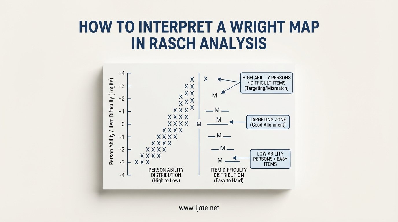
If you have ever stared at the output of a Rasch analysis and felt unsure about what the vertical chart in front of you actually means, you are not alone. Researchers, test developers, and graduate students frequently tell us on forums like the Rasch Measurement Forum that the Wright map is the single most useful, yet initially confusing, output from a Rasch analysis. Once you know how to read it, the map becomes a quick diagnostic tool for your entire assessment.
This guide walks through how to interpret a Wright map in Rasch analysis from the ground up. We cover the logit scale, the left and right sides of the map, the M/S/T markers, targeting, gaps, and the practical decisions you can make from what the map tells you. By the end, you should be able to look at any person-item map and confidently explain what it reveals about your test and your population.
We have built this guide to address the most common pain points researchers raise, including confusion about the logit scale, misreading the M/S/T markers, and not knowing how to translate the map into test improvement actions. Whether you are using Winsteps, the WrightMap package in R, or another tool, the interpretation principles here apply universally.
Table of Contents
What Is a Wright Map in Rasch Analysis?
A Wright map is a graphical display produced in Rasch analysis that places person abilities and item difficulties on the same vertical measurement scale. It is named after Benjamin Wright, who, alongside John Michael Linacre, developed much of the practical Rasch measurement framework at the University of Chicago. The map is sometimes called a person-item map because that is exactly what it shows: where people sit and where items sit along a shared latent variable.
The core idea is simple but powerful. Because the Rasch model calibrates both persons and items in the same unit (logits), you can plot them together. When a person and an item appear at the same horizontal level on the map, that person has roughly a 50% probability of answering that item correctly. Move the person above the item, and the probability increases. Move the person below, and the probability drops. This direct visual link between ability and difficulty is what makes the Wright map such a widely used diagnostic.
Researchers use Wright maps during instrument development, test validation, item banking, and curriculum alignment. If you are building a language proficiency test, a patient-reported outcome measure, or a licensure exam, the map tells you at a glance whether your items are well matched to your sample and whether your test covers the full range of the latent trait. Without this visual, you would need to cross-reference tables of person measures and item calibrations manually, which is slow and error-prone.
It is worth noting that a Wright map is a summary of model estimates, not raw data. The positions reflect what the Rasch model estimates after accounting for measurement error. That means the map already incorporates fit statistics and the probabilistic framework of the model. When you interpret it, you are reading the model’s best guess at where each person and each item stand on the underlying construct.
How to Interpret a Wright Map in Rasch Analysis: The Core Structure
Before diving into left-side and right-side details, you need to understand the overall layout. A Wright map is essentially two vertical histograms placed side by side, sharing a common vertical axis measured in logits. The top of the map represents higher ability and higher difficulty; the bottom represents lower ability and lower difficulty. This shared axis is what allows direct comparison between people and items.
The logit scale is the natural logarithm of the odds of success. A logit of zero means a person has a 50% chance of answering a similarly calibrated item correctly. Positive logits indicate above-average ability or difficulty, while negative logits indicate below-average ability or difficulty. You do not need to do logarithm math by hand to read the map, but you should understand that each logit unit represents a multiplicative change in the odds of a correct response.
Most Wright maps include a column of numbers on the far left or center showing the logit values, typically ranging from around negative three to positive three for well-targeted assessments. Alongside this scale, you will see three letters that act as reference markers: M, S, and T. These markers summarize the distribution of persons and items separately, and they are the key to a fast targeting check.
On the left side of the map, each X typically represents one person or a small group of persons at that ability level. On the right side, you will see item numbers or short labels showing where each item sits on the difficulty scale. Items at the top are hard; items at the bottom are easy. The vertical alignment of persons and items is what gives the map its diagnostic power, because you can immediately see whether your items cover the range of abilities in your sample.
How to Interpret the Left Side: Person Ability Distribution
The left side of a Wright map shows the distribution of person ability measures along the latent variable. Each X usually represents one individual, though some software lets you set a number so that each X stands for several people. The X symbols stack up to form a vertical histogram, with the most able persons at the top and the least able at the bottom.
When you read the left side, start by locating the M marker. The M on the left represents the mean person ability for your sample. This is the average location of all the people who took the test. If the person mean sits high on the scale, your sample is relatively able compared to the items. If it sits low, your sample found the test difficult overall. Either situation signals a potential targeting problem, which we cover in the targeting section below.
Next, look at the spread of the X symbols. A wide, even spread means your sample covers a broad range of the latent trait, which gives you richer information about item performance. A tight cluster suggests your sample is fairly homogeneous, which limits what you can learn about items at the extremes. If you see a long tail at the top with no items nearby, your most able persons were not challenged. If you see a long tail at the bottom, your least able persons may have been overwhelmed by items well above their level.
Pay attention to the S and T markers on the left side as well. The S marker sits one standard deviation above or below the person mean, and the T marker sits two standard deviations out. These markers help you quickly gauge how dispersed the person distribution is. A narrow S-to-S range means most people cluster near the average, while a wide S-to-S range indicates substantial variability in ability within your sample.
One common point of confusion: the left side does not show raw scores. It shows estimated ability measures in logits, which have been adjusted for the difficulty of the items each person encountered. Two people with the same raw score can land at different spots on the map if they answered different subsets of items. This is especially relevant in adaptive testing or when there is missing data.
How to Interpret the Right Side: Item Difficulty Distribution
The right side of a Wright map displays the difficulty calibration of each item along the same logit scale. Items at the top of the map are the hardest, requiring high ability to answer correctly. Items at the bottom are the easiest. The M marker on the right side represents the mean item difficulty, which is often set to zero logits by convention in Rasch software like Winsteps.
When reading the right side, the first thing to check is whether items are spread evenly across the range of person abilities. An ideal test has items distributed from below the lowest person to above the highest person, with no large vertical gaps. A gap on the item side means there is a range of the latent trait where your test provides very little information. If a person happens to fall inside that gap, you cannot precisely estimate their ability.
Look for clusters of items at the same difficulty level. A cluster suggests several items are measuring essentially the same point on the scale, which can indicate redundancy. If five items all calibrate at roughly the same logit value, you may be able to remove some without losing measurement information. This is one of the most practical uses of the Wright map for test refinement.
The ordering of items on the right side should also make substantive sense. If you are measuring reading comprehension, for example, items associated with longer or more technical passages should generally appear higher on the scale than items based on simple texts. If an item you expected to be easy shows up near the top, that is a red flag worth investigating. It could indicate a flawed item, a miskeyed answer, or a construct mismatch.
Watch for items that appear at the very top or very bottom of the map with no persons nearby. Items above the most able person are too hard for your sample, which means almost everyone got them wrong and they provide minimal information about individual differences. Items below the least able person are too easy, and almost everyone got them right. Both situations waste testing time without adding measurement value.
Understanding the M, S, and T Markers on a Wright Map
The M, S, and T markers appear on both sides of the Wright map, and they are the fastest way to assess targeting at a glance. M stands for the mean, S marks one standard deviation from the mean, and T marks two standard deviations. Each side has its own set of these markers because the person distribution and the item distribution are separate.
The most important comparison is between the two M markers. If the person M and the item M sit at roughly the same logit level, your test is well targeted for your sample. This means the average difficulty of your items matches the average ability of your test takers. If the person M sits well above the item M, the test was too easy for the sample. If the person M sits well below the item M, the test was too hard. Both mismatches reduce measurement precision because you get the most information from items that are close to each person’s ability level.
The S markers help you check whether the spread of persons and items is comparable. If the item S-to-S range is much narrower than the person S-to-S range, your items do not cover the full ability range of your sample. If the item spread is much wider than the person spread, you may have more items than necessary at the extremes, where few of your test takers actually fall.
The T markers show the outer edges of the typical distribution. Items beyond the T range on the person side serve only the most extreme individuals. If no persons fall beyond the item T markers, those extreme items may be candidates for revision or removal, depending on your measurement goals and the population you intend to serve with the instrument.
Evaluating Targeting Using the Wright Map
Targeting refers to how well the difficulty of your items matches the ability of your sample, and the Wright map is the primary tool for assessing it. Good targeting means the item distribution overlaps substantially with the person distribution, with items spread across the full range of person abilities. Poor targeting shows up as a visible mismatch between the two sides of the map.
To evaluate targeting systematically, start with the two M markers. A difference of less than half a logit between the person mean and item mean is generally considered acceptable targeting. A difference of one logit or more signals a meaningful mismatch that affects measurement precision. In a certification exam context, poor targeting can mean the difference between a reliable pass-fail decision and a coin flip for borderline candidates.
Next, scan for gaps. A gap is a vertical zone on the map where there are items but no persons, or persons but no items. Gaps on the item side within the person range are the most problematic, because they indicate the test cannot distinguish between people whose abilities fall in that zone. If you are developing a placement test, a gap in the middle of the ability range could mean that students near the cut score are being classified imprecisely.
Then check the pass point if your test has one. The pass point on a Wright map is the logit value at which a candidate has a specified probability (often 50%) of answering a typical item correctly. If the pass point sits in a dense area of items, your test discriminates well around the decision boundary. If the pass point falls in a gap, you should consider adding or revising items near that difficulty level to improve decision accuracy.
Finally, translate your targeting findings into action. If items are too easy, write harder ones or adapt existing items to target higher ability. If items cluster at one difficulty, diversify the range. If there is a gap in the middle of your scale, design new items specifically to fill it. The Wright map gives you the diagnostic information; the next step is item development work informed by what the map shows.
Common Mistakes When Interpreting a Wright Map
Even experienced researchers make interpretation errors with Wright maps. Knowing the common pitfalls ahead of time will save you from drawing incorrect conclusions about your test quality.
The first frequent mistake is treating the map as a deterministic predictor. When a person and item align on the map, it means the person has about a 50% chance of answering correctly, not that they will definitely get it right half the time. The Rasch model is probabilistic, and the map reflects expected probabilities, not certainties. A person below an item can still answer correctly, just less often.
A second common error is ignoring the logit scale entirely and treating the map as a simple ranking. The vertical distance between items matters. Two items separated by one logit have a meaningful difference in difficulty, while two items half a logit apart are quite similar. Reading the map without attending to the scale values can lead you to overstate or understate differences between items.
A third mistake is misreading the M, S, and T markers. Some beginners assume these markers apply to the map as a whole, but each side has its own markers. The person M reflects the average ability of the sample, while the item M reflects the average difficulty of the test. Confusing the two leads to incorrect targeting conclusions.
A fourth pitfall is overlooking gaps in the item distribution. It is easy to focus on where items and persons overlap and miss the zones where there are no items at all. Those gaps represent measurement blind spots, and they matter especially when they fall near a cut score or within the central range of your sample’s ability distribution.
Finally, do not treat a Wright map from a single small sample as definitive. Item calibrations and person estimates both carry standard errors, and small samples produce unstable estimates. If your map looks odd, check your sample size, fit statistics, and dimensionality before making major decisions about item retention or revision.
Software Tools for Creating Wright Maps
Several software packages produce Wright maps, and the interpretation principles remain the same regardless of which tool you use. Winsteps is the most widely used dedicated Rasch analysis program, and its Table 1 output is the standard Wright map format that many researchers reference. Winsteps allows you to customize the person grouping, item labels, and display format.
For R users, the WrightMap package works with output from the TAM package and other IRT and Rasch tools in R. The edmeasurementsurveys.com tutorial covers how to generate a Wright map from WLE estimates using the WrightMap package, and it includes comparison with Classical Test Theory statistics. The flexplot and ggplot frameworks also allow custom Wright map visualizations if you need publication-quality figures.
Other options include RUMM2030, which produces its own variant of the person-item map, and ConQuest, which offers flexible multilevel Rasch modeling with map output. The choice of software affects the visual format but not the underlying interpretation. The logit scale, the two-sided layout, and the targeting logic are consistent across platforms.
A Step-by-Step Checklist for Reading Any Wright Map
Use this checklist every time you open a Wright map output. It covers the key interpretation steps in order and helps you avoid skipping important diagnostics.
Step 1: Orient yourself to the logit scale on the vertical axis. Note the range and where zero sits, since zero is often the item mean by default.
Step 2: Locate the two M markers. Compare their vertical positions to get an instant read on targeting. Close together means good targeting; far apart means a mismatch.
Step 3: Scan the left side for the shape and spread of the person distribution. Note any long tails or tight clusters that signal range issues.
Step 4: Scan the right side for item spread and ordering. Confirm that the ordering makes substantive sense for your construct.
Step 5: Look for gaps on both sides. Identify any zones where persons exist but no items do, or vice versa. Flag gaps near cut scores or within the central ability range as priorities for item development.
Step 6: Check the S and T markers to assess distribution width. Compare person spread to item spread to see whether your test covers the full range of your sample.
Step 7: Translate findings into action items. List specific decisions about item revision, new item development, or targeting adjustments based on what the map reveals.
FAQs
What is a Wright map?
A Wright map is a graphical display in Rasch analysis that shows person abilities and item difficulties on the same vertical logit scale, allowing direct visual comparison between what examinees can do and what test items measure.
How do you interpret a Wright map?
Read the left side for person ability distribution and the right side for item difficulty. Compare the M markers for targeting, check for gaps, and use the shared logit scale to see where persons and items align. When a person and item sit at the same level, the person has roughly a 50% probability of answering correctly.
What does Rasch analysis measure?
Rasch analysis measures a latent variable, such as ability, attitude, or proficiency, by placing persons and items on a shared interval scale measured in logits. It tests how well observed responses fit a probabilistic model that converts raw responses into linear measures.
What is the difference between Rasch and IRT?
Rasch analysis is a specific one-parameter item response theory model that treats item discrimination as fixed and focuses on building interval-level measurement. Broader IRT models, such as the two-parameter and three-parameter models, estimate additional parameters like discrimination and guessing. Rasch prioritizes measurement quality, while general IRT prioritizes data-model fit.
Putting It All Together
Learning how to interpret a Wright map in Rasch analysis unlocks one of the most practical diagnostics in psychometric work. The map gives you a single visual that shows person ability, item difficulty, targeting quality, measurement gaps, and the substantive ordering of your items along the latent variable. Once you internalize the structure and the step-by-step checklist, you can assess any test output in minutes rather than digging through tables of estimates.
If you are new to this, start with the two M markers and work outward. Confirm targeting, scan for gaps, check item ordering, and then decide on concrete actions like writing new items, revising misfitting ones, or adjusting your sample. The Wright map does not replace fit statistics or dimensionality checks, but it gives you the visual context those numbers alone cannot provide.
For your next analysis, open your Winsteps Table 1 or your R WrightMap output, and run through the seven-step checklist above. Each pass will sharpen your interpretation skills and help you make better measurement decisions for your assessment instrument.