
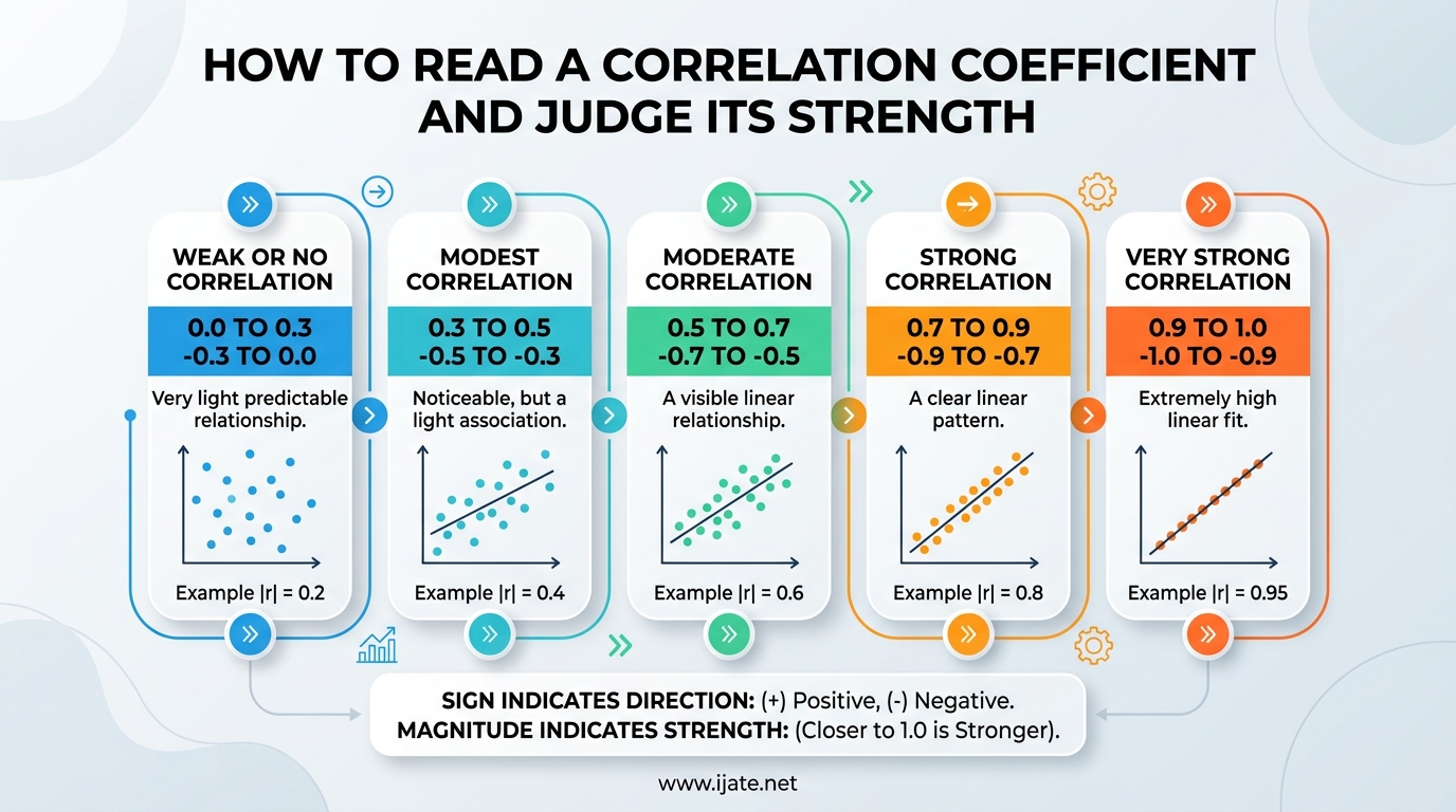
If you have ever stared at a statistics output and wondered what that decimal number between -1 and +1 actually means, you are in the right place. A correlation coefficient is one of the most widely used statistical tools, yet it is also one of the most misunderstood. Researchers, students, and data analysts across every field rely on it to make sense of relationships between variables.
Learning how to read a correlation coefficient and judge its strength is a skill that pays off far beyond the classroom. Whether you are analyzing survey data, reading a research paper, or making business decisions, you need to know whether a relationship is weak, moderate, or strong. You also need to understand direction, significance, and the critical difference between correlation and causation.
In this guide, our team breaks down everything you need to know. We cover the definition, the value range, strength categories with a clear interpretation table, the difference between positive and negative correlations, Pearson versus Spearman, statistical significance, and common pitfalls. By the end, you will be able to look at any correlation coefficient and confidently explain what it means.
Table of Contents
What Is a Correlation Coefficient?
A correlation coefficient is a statistical measure that quantifies both the strength and direction of the linear relationship between two variables. It condenses an entire scatterplot into a single number, giving you a quick snapshot of how closely two variables move together.
The most common type is Pearson’s r, developed by Karl Pearson in the late 1800s. Pearson’s r measures the degree of linear association between two continuous variables. If you think of a scatterplot as a cloud of data points, the correlation coefficient tells you how tightly those points cluster around a straight line.
It is important to note that correlation coefficients only capture linear relationships. Two variables might have a strong curved or nonlinear relationship, but the correlation coefficient could read close to zero. This is why visualizing your data with a scatterplot before trusting the number is always a smart move.
There are also non-parametric alternatives like Spearman’s rho and Kendall’s Tau, which we cover later in this guide. Each type of coefficient has its own assumptions and ideal use cases, but all of them share the same basic output: a number between -1 and +1.
Understanding the Range: -1 to +1
Every correlation coefficient falls on a spectrum from -1 to +1. This range is fixed, which means the value can never go below -1 or above +1. Understanding what each endpoint represents is the first step in reading the number.
A value of +1 indicates a perfect positive linear relationship. Every data point falls exactly on a straight upward-sloping line. If you know one variable, you can predict the other with complete accuracy.
A value of -1 represents a perfect negative linear relationship. The data points form a perfectly straight downward-sloping line. As one variable increases, the other decreases in a completely predictable way.
A value of 0 means there is no linear relationship between the two variables. The scatterplot looks like a random cloud of points with no discernible pattern. Knowing the value of one variable tells you nothing about the other.
Most real-world correlations fall somewhere between these extremes. A coefficient of 0.85 tells you the relationship is strong and positive. A coefficient of -0.30 tells you the relationship is weak and negative. The sign tells you the direction, and the distance from zero tells you the strength.
How to Read a Correlation Coefficient and Judge Its Strength
Reading a correlation coefficient comes down to two questions: how strong is the relationship, and what direction does it go? The direction is straightforward. A positive sign means the variables move together, and a negative sign means they move in opposite directions. We cover direction in detail in the next section.
For strength, statisticians have developed widely accepted categories that map specific value ranges to descriptive labels. The absolute value of the coefficient is what matters here. A correlation of -0.8 is just as strong as a correlation of +0.8. The sign only tells you the direction.
Below is the standard interpretation scale used across many statistics textbooks and research guides. This is the table we recommend bookmarking for quick reference.
Correlation Strength Interpretation Table:
| Absolute Value of r | Strength Category | What It Means |
|—|—|—|
| 0.00 to 0.10 | Negligible or none | Virtually no linear relationship between the variables |
| 0.10 to 0.30 | Weak | A slight linear relationship exists but is not reliable for prediction |
| 0.30 to 0.50 | Moderate | A meaningful linear relationship that may be useful in some contexts |
| 0.50 to 0.70 | Strong | A solid linear relationship suitable for prediction |
| 0.70 to 0.90 | Very strong | An excellent linear relationship between the variables |
| 0.90 to 1.00 | Extremely strong or near perfect | Nearly perfect linear association, rare in real-world data |
Here is how to use this table in practice. Take the absolute value of your coefficient first, since the sign only indicates direction. Then find where that number falls in the table above. That gives you a plain-language label for the strength of the relationship.
For example, if your analysis produces an r of 0.45, you take the absolute value (0.45) and see it falls in the moderate range. If you get an r of -0.82, the absolute value is 0.82, which falls in the very strong category. The negative sign simply tells you that as one variable increases, the other decreases.
It is worth noting that these thresholds are guidelines, not rigid rules. Some fields use slightly different cutoffs. Psychology researchers might call 0.30 moderate, while a physics experiment might consider anything below 0.95 nearly useless. We discuss field-specific differences later in this guide.
Step-by-Step: Reading Any Correlation Coefficient
Follow these steps every time you encounter a correlation coefficient and you will interpret it correctly.
Step 1: Check the sign. A positive value means both variables increase together. A negative value means one goes up while the other goes down.
Step 2: Take the absolute value. Ignore the sign for now and focus on the magnitude. This tells you how strong the linear relationship is.
Step 3: Match it to a strength category. Use the table above to assign a label like weak, moderate, or strong.
Step 4: Check statistical significance. A strong correlation from a tiny sample might not be trustworthy. Always pair the coefficient with its p-value or sample size.
Step 5: Look at a scatterplot. The coefficient only captures linear patterns. A scatterplot can reveal outliers, clustering, or nonlinear patterns the number alone would miss.
Positive vs Negative: Reading the Direction
The sign of a correlation coefficient tells you the direction of the relationship. This is independent of strength, so both positive and negative correlations can be weak, moderate, or strong.
A positive correlation means that as one variable increases, the other variable also tends to increase. The classic example is height and shoe size. Taller people generally have larger feet. Another real-world example is the relationship between hours studied and exam scores. More study time tends to produce higher scores.
A negative correlation means that as one variable increases, the other tends to decrease. Think of temperature and heating bills. As the outside temperature rises, heating costs go down. Another example is the relationship between a car’s age and its resale value. As the car gets older, its value drops.
Here is a common source of confusion. A negative correlation is not weaker or less important than a positive one. A correlation of -0.90 represents an equally strong relationship as +0.90. The only difference is the direction in which the variables move.
When reporting a correlation, always describe both the direction and the strength. Saying “there is a strong negative correlation” is far more informative than just saying “the correlation is -0.75.” Your audience may not intuitively know that -0.75 represents a strong relationship.
It is also possible for two variables to have zero correlation despite being related in a nonlinear way. For instance, a U-shaped relationship would produce a correlation near zero even though the variables are clearly connected. This is why scatterplots matter so much.
Pearson vs Spearman: Choosing the Right Coefficient
There are several types of correlation coefficients, but the two you will encounter most often are Pearson’s r and Spearman’s rho. Choosing the right one depends on your data and what you are trying to measure.
Pearson’s r measures the strength and direction of a linear relationship between two continuous variables. It is the most widely used correlation coefficient and the one most people mean when they say “correlation.” Pearson’s r assumes that both variables are normally distributed, measured on an interval or ratio scale, and related in a linear fashion.
Spearman’s rho measures the strength and direction of a monotonic relationship based on ranked data. Instead of using the raw values, Spearman converts each variable to ranks and then calculates Pearson’s r on those ranks. This makes Spearman more robust to outliers and better suited for ordinal data or data that does not follow a normal distribution.
Use Pearson’s r when your data is continuous, approximately normally distributed, and you care specifically about linear relationships. Use Spearman’s rho when your data is ordinal, ranked, or contains significant outliers. Spearman is also the safer choice when your data violates Pearson’s normality assumption.
There is also Kendall’s Tau, another rank-based coefficient that some statisticians prefer for small sample sizes. Kendall’s Tau is less commonly used but is considered more robust and interpretable in certain research contexts.
The choice matters because using Pearson’s r on heavily skewed data or extreme outliers can produce misleading results. The coefficient might appear weak when a strong nonlinear relationship exists, or it might appear strong when the result is driven by a single outlier.
Quick Decision Guide
Use Pearson’s r if your data is continuous, roughly normally distributed, and free of extreme outliers. Use Spearman’s rho if your data is ordinal, non-normal, or has outliers you want to down-weight. Use Kendall’s Tau if you have a small sample or want a coefficient that is especially robust.
A good practice is to calculate both Pearson and Spearman and compare them. If the two values are similar, you can feel confident in the result. If they differ substantially, investigate your data for outliers, nonlinearity, or non-normal distributions.
Statistical Significance vs Strength: Two Different Things
One of the most common mistakes people make is confusing strength with statistical significance. These are two separate concepts that tell you different things about your correlation coefficient.
Strength refers to how closely the two variables are related. A coefficient of 0.85 indicates a very strong relationship, while 0.15 indicates a weak one. Strength is entirely about the magnitude of the number.
Statistical significance, reported as a p-value, tells you how confident you can be that the observed correlation is real and not due to random chance. A p-value below 0.05 is the conventional threshold for significance, meaning there is less than a 5 percent probability that the correlation appeared by random chance alone.
Here is the key insight: a weak correlation can be statistically significant if the sample size is large enough. Similarly, a strong correlation can fail to reach significance if the sample size is small. A correlation of 0.15 from a sample of 2,000 might be statistically significant, but that does not make the relationship strong in practical terms.
Always report both the correlation coefficient and its p-value. The coefficient tells you the strength and direction. The p-value tells you whether you can trust that the observed relationship is genuine rather than a fluke of sampling.
Researchers on forums like r/AskStatistics frequently ask about this distinction. Many students assume a significant p-value automatically means a strong relationship. It does not. Significance and strength answer different questions and should never be used interchangeably.
The Coefficient of Determination (R-Squared)
The coefficient of determination, commonly called r-squared, is a related statistic that adds valuable context to any correlation coefficient. It is simply the correlation coefficient squared, expressed as a percentage.
To calculate r-squared, square the correlation coefficient and multiply by 100. For example, if r equals 0.70, then r-squared equals 0.49, or 49 percent. This means that 49 percent of the variation in one variable can be explained by the other variable.
This interpretation is powerful because it puts the strength of the correlation into practical terms. A correlation of 0.50 sounds moderate, but r-squared tells you that only 25 percent of the variation is shared. That puts the relationship in a very different light.
Consider another example. A correlation of 0.30 has an r-squared of just 9 percent. Even though 0.30 might be called moderate on the interpretation scale, it only explains 9 percent of the variability. The remaining 91 percent is due to other factors.
Many statistics educators recommend always reporting r-squared alongside the correlation coefficient. The raw coefficient can be misleading without understanding how much variance is actually shared. R-squared makes the practical significance clearer.
Forum discussions on r/statistics reveal that confusion between r and r-squared is one of the most frequent questions students ask. Remember: the correlation coefficient tells you about the linear relationship on a -1 to +1 scale, while r-squared tells you the proportion of shared variance as a percentage.
Correlation Does Not Imply Causation
You have probably heard this phrase before, but it deserves a dedicated section because the mistake is so common and so costly. A correlation between two variables does not mean that one causes the other.
Here is why this happens. When two variables are correlated, there are at least three possible explanations. Variable A might cause variable B. Variable B might cause variable A. Or a third variable C might cause both A and B. The correlation coefficient alone cannot distinguish between these scenarios.
Consider a classic example. Ice cream sales and drowning incidents are positively correlated. As ice cream sales go up, drowning incidents go up. Does eating ice cream cause drowning? Of course not. The hidden third variable is temperature. Hot weather increases both ice cream consumption and swimming activity, and more swimming leads to more drownings.
This type of hidden variable is called a confounder or confounding variable. Confounders are the reason observational studies cannot establish causation on their own. Only controlled experiments, where researchers manipulate one variable while holding others constant, can demonstrate causal relationships.
Another memorable example involves shoe size and reading ability in children. The two are positively correlated, but neither one causes the other. The confounder is age. Older children have bigger feet and better reading skills, but the relationship between shoe size and reading is purely coincidental.
Whenever you read a correlation coefficient, ask yourself: could a third variable explain this relationship? Could the direction of causality be reversed? Could the correlation be entirely spurious? Training yourself to ask these questions is one of the most valuable habits in data analysis.
Common Mistakes When Reading Correlation Coefficients
Even experienced researchers make errors when interpreting correlation coefficients. Here are the most common pitfalls and how to avoid each one.
Mistake 1: Ignoring the absolute value. People sometimes assume a negative correlation is weaker than a positive one. It is not. A correlation of -0.80 is just as strong as +0.80. Always look at the absolute value when judging strength.
Mistake 2: Confusing strength with significance. As we discussed, these are different concepts. A significant correlation is not necessarily strong, and a strong correlation is not always significant. Report and interpret both.
Mistake 3: Assuming a linear relationship exists when it does not. Pearson’s r only measures linear association. If the relationship is curved, the coefficient may understate the true connection. Always plot your data before drawing conclusions.
Mistake 4: Overlooking outliers. A single extreme data point can dramatically inflate or deflate a correlation coefficient, especially in small samples. Spearman’s rho and visual inspection help catch outlier-driven correlations.
Mistake 5: Extrapolating beyond the data. A correlation found in one population may not hold in another. A correlation between exercise and happiness in adults does not necessarily apply to teenagers. Context matters enormously.
Mistake 6: Treating correlation as causation. We covered this above, but it bears repeating. If you find yourself thinking “X causes Y” based on a correlation coefficient, stop and look for alternative explanations.
Mistake 7: Using Pearson’s r with inappropriate data. Categorical data, ordinal data, and heavily skewed distributions violate Pearson’s assumptions. Use Spearman’s rho or Kendall’s Tau instead.
Avoiding these mistakes takes practice and discipline. The best approach is to always pair the coefficient with a scatterplot, a p-value, and a healthy dose of skepticism about causation.
Real-World Examples of Correlation Strength
Real-world examples make interpretation much easier to remember. Here are some well-known correlations across different fields that illustrate various strength levels.
Strong positive correlation (approximately 0.85): Height and arm span in adults tend to correlate very strongly. Knowing someone’s height gives you a reliable estimate of their arm span. This is the kind of relationship where prediction works well.
Moderate positive correlation (approximately 0.45): Hours of sleep and academic performance often show a moderate positive correlation. More sleep tends to correspond with better grades, but many other factors also play a role.
Weak positive correlation (approximately 0.20): Some studies have found a weak positive correlation between coffee consumption and certain health outcomes. The relationship exists but is too small to be useful for individual predictions.
Strong negative correlation (approximately -0.75): Temperature and heating bills show a strong negative correlation. As the outside temperature drops, heating costs rise sharply. This is a dependable and practically significant relationship.
Moderate negative correlation (approximately -0.40): In some studies, television watching and academic performance show a moderate negative correlation. More screen time tends to correspond with lower grades, though causation has not been established.
Field-specific interpretation also matters. In psychology, a correlation of 0.30 might be considered meaningful because human behavior is complex and influenced by countless variables. In physics, researchers might expect correlations above 0.95 before they consider a relationship reliable. In medical research, even small correlations can have significant public health implications when applied to large populations.
The lesson here is that context shapes interpretation. Always consider the field, the sample, and the practical stakes when judging whether a correlation is meaningful.
FAQs
How to interpret the strength of a correlation coefficient?
To interpret the strength of a correlation coefficient, take the absolute value of r and match it to standard categories: 0.00 to 0.10 is negligible, 0.10 to 0.30 is weak, 0.30 to 0.50 is moderate, 0.50 to 0.70 is strong, and 0.70 to 1.00 is very strong. The sign indicates direction (positive or negative), while the distance from zero indicates strength.
Is 0.5 a strong or weak correlation?
A correlation of 0.5 is generally considered moderate to strong. Using the standard interpretation scale, it sits right at the boundary between moderate and strong. It indicates a meaningful linear relationship that may be useful for prediction, especially when paired with a sufficiently large sample and statistical significance.
Is a correlation coefficient of 0.7 strong?
Yes, a correlation coefficient of 0.7 is considered strong. On the standard interpretation scale, values between 0.50 and 0.70 are classified as strong, and values between 0.70 and 0.90 are very strong. A coefficient of 0.7 means the two variables have a solid linear relationship suitable for reliable prediction.
Is 0.4 a strong or weak correlation?
A correlation of 0.4 falls in the moderate range. It is stronger than a weak correlation but does not reach the strong threshold of 0.50. While 0.4 indicates a meaningful relationship, its r-squared value is only 0.16, meaning just 16 percent of the variation is shared between the two variables.
Putting It All Together
Learning how to read a correlation coefficient and judge its strength is a foundational data literacy skill. The process comes down to checking the sign for direction, taking the absolute value for strength, matching it to a category, verifying significance, and never assuming causation without controlled evidence.
Keep the interpretation table handy, always pair your coefficient with a scatterplot, and remember that context shapes what counts as meaningful. A moderate correlation in psychology might be a game-changing finding, while the same value in physics might be dismissed as noise.
If you want to go deeper, practice calculating Pearson’s r and Spearman’s rho on datasets you encounter. The more you work with real data, the more intuitive these numbers become. Your next step is to apply this framework to your own analysis and see how quickly it becomes second nature.